Election Logos: An Insight to Candidates
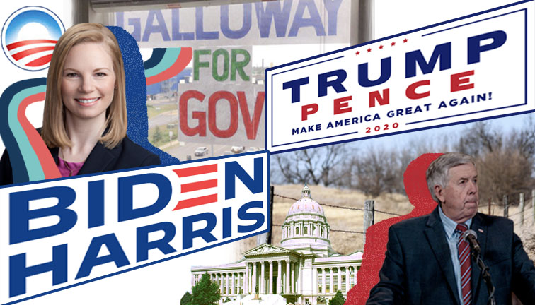
There are many great ways to learn about a candidate during an election and a campaign logo is one of them. Campaign logos can instantaneously share with voters what a candidate is running on. The font, imagery and placement of a logo all contribute to a subtextual message that can be shared through a glance at a sign or a T-shirt.
Below are descriptions and interpretations of four major campaigns affecting the St. Louis area for the 2020 election. Remember that that is what they merely are: interpretations. It’s possible that you may find a different meaning. Either way, analyzing the logo of a campaign is an efficient way to learn who a candidate is and what their beliefs are.
Joe Biden for US President
This campaign relies heavily on history when presenting their logo and design. One prevalent logo from the 2008 presidential election is Obama’s O. It was a simple design, a blue O with a red and white field cascading down the bottom. It’s a hard logo to forget. Joe Biden wants to make sure you don’t forget by associating himself to that O. Obama used Gotham font, which is a futuristic, simple sans-serif. Obama was the young, fresh, forward-looking candidate and the font served him well. Biden has been utilizing Decimal font, which is very similar to Gotham, but it is a little more industrial and angular. What better way not only to associate with the popular former president, but to also connect to an industrial root? Biden is from Scranton, PA (and he does not want you to forget that either). Along with the similar font, the Biden campaign uses the red and white stripes to make the “E” in “BIDEN”— almost as an homage to the Obama O. He is presenting himself as a forward-looking candidate, like Obama, but with his own flair of expertise and experience.
Donald Trump for US President
Considering how the Biden logo is very reminiscent of the past, the Trump nameplate logo (the one that simply says Trump-Pence-2020) does not stray too far from past designs either. Interestingly enough, though, Trump uses the Berthold Akzidenz-Grotesk Bold Extended font. It’s sans-serif and pretty straightforward, but it’s not a super dynamic font, like Gotham or Decimal. What you see is what you get, and the Trump campaign has kept the logo the same. What is new in 2020, though, is Trump’s new America First logo, which is separate from the nameplate. It just so happens that the new logo immediately raised red flags upon its release. It looks a lot like a Nazi symbol. There is an imperial eagle holding a circular version of the American flag, with 20th-century style bold red lettering that spells “AMERICA FIRST”. There’s not much more to say on this one rather than reminding you that the first logo, the name plate one, tells us that what we see is what we get.
Mike Parson for Governor of Missouri
There’s a very definitive style when it comes to rural campaigns in Missouri, and Mike Parson’s logo fits right in. These logos don’t use anything too fancy or too dynamic. They’re usually put up on barbed wire fences right next to the “No Trespassing” signs, and they all look the same. Even though Parson is running for governor, this sign could aesthetically fit in with the signs for local races like sheriff or county assessor in any small Missouri town. Which makes sense—Parson got his start in public service as Polk County sheriff. This logo wants you to recognize that connection. Using Lucida Bright for its main font, it’s not too fancy and it’s not too dynamic, but it still has appeal. Mike Parson is telling voters that he is a governor who will stay the course and not shake things up too much—just as constant as the barbed wire fences that line the Missouri countryside.
Nicole Galloway for Governor of Misosuri
Based on the logo for Nicole Galloway’s campaign—she might just shake things up, and she does want you to know that. Galloway is following suit of many 2020 campaigns by straying from the regular red, white and blue color palette. Think of Kamala Harris, Amy Klobuchar and Elizabeth Warren—all very qualified women who ran for president. The Galloway campaign is in a similar situation with their use of navy blue, coral and teal. She is a reliable candidate (navy blue), yet she brings a fresh take to the governorship (coral and teal). Parson thinks he can win by relying on a more subtle approach, but Galloway recognizes that some Missouri voters are looking for a fresh change. In 2018 then-Governor Eric Greitens stepped down from his position due to a sex scandal and a campaign finance violation. There has been a lot of turbulence in Missouri politics ever since, so it makes sense why Nicole Galloway is campaigning with fresh colors. Just like Biden, her font is similar to the san-serif Gotham used by Obama. If elected, she would be the first woman governor of Missouri, so the colors and the futuristic font showcase how her campaign would change things up in Jefferson City.
Your donation will support the student journalists of Saint Louis University.


