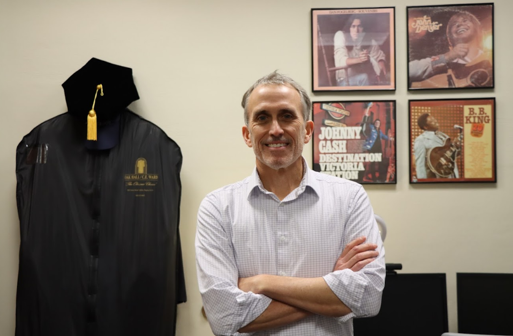
Students browsing through Saint Louis University’s Web page may have noticed a new look to SLU.EDU.
The newest version of SLU.EDU debuted last week on Sept. 1. The site includes a new graphical user interface on the home page, secondary pages and some third tier pages.
“We changed the look and feel,” said Michael Burks, director of University Web Development.
The top-level pages contain three different ways of navigating around the site, according to Burks.
The first way to navigate is for the stakeholder group, or the main groups of people who use the site including students, faculty and alumni of the University. “We designed these pages hopefully in a way that will benefit those groups using them,” Burks said.
Burks said that web developers conducted tests with members of each of these groups to see what they would use most often. Burks referred to this as the “usability act.”
“The philosophy of this is a user-centered design,” Burks said. “We tried to view it from the user perspective.”
The second part of the Web site provides direct access to popular topics including academics and library. The third and final way to navigate is more general; it is done with the use of the top banner. “This is part of the standard template,” Burks said.
The Web team at the University arrived at the changes in design based from a series of Web surveys. Other factors included the analysis of current site usage and the advice of the Web Advisory Council.
“These activities provided the information we needed to implement principles of user-centered design,” Burks said in an e-mail addressed to the University last week.
Burks was hired by the University in an effort to re-engineer the Web site. He said he hopes that it efficiently and effectively supports the University more, and the primary tasks of teaching, service and research.
One of the main changes to the site is that the dominant color is now royal blue. “We call this SLU-blue,” Burks said.
Burks promised that the change in the Web design is only the beginning. “Over the next several weeks, we will be converting, or helping section administrators convert, more pages to the new look and feel and implementing increased functionality,” he said. “Look for changes to the site daily, weekly and monthly.”
Burks invites suggestion or comments from members of the University. Any input should be e-mailed either to the [email protected] or [email protected].


